Understanding User Needs:
I recognized the need for a report card that is both simple to understand and visually appealing. In the digital age, especially during the pandemic, it’s crucial that students and parents can easily access and interpret performance data remotely.
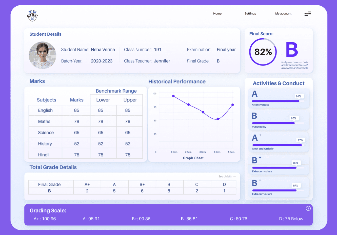
Design Process:
My design process began with research. I looked at existing digital report cards to understand their strengths and weaknesses. Then, I brainstormed various layouts and visual elements that could make the report card more user-friendly. After sketching out a few ideas, I used a design tool to create a prototype, which I refined over several iterations until I was satisfied with the result.
Design Decisions:
For the layout, I chose a clean and organized structure that logically groups related information. This helps users quickly locate specific data points without feeling overwhelmed. The color scheme of purple and white was selected for its modern feel and the contrast it provides, which enhances readability. I opted for legible fonts to ensure that the text is easy to read at various sizes. Data visualization was another key aspect; I included a line graph for historical performance to give a clear visual representation of progress over time.
Addressing the Assignment Goals:
I made sure to include all the necessary performance metrics, such as individual subject marks, grades, and class averages. The grading system is clearly defined, allowing for quick comprehension of the student’s standing. Additionally, I incorporated a historical performance graph to provide insight into the student’s academic journey.
Conclusion:
Throughout the design process, my focus was on creating a user-centered design that did not compromise on aesthetics. I believe that the final design achieves the assignment’s objectives by providing a clear and comprehensive overview of student performance in a format that is both accessible and engaging. In future iterations, I would consider adding personalized feedback or recommendations for improvement to further enhance the dashboard’s utility.